Mini IA Case Study
REL ACOUSTICS Website Relaunch
Standardizing navigation and information architecture across desktop, iPad, and mobile for a premium subwoofer brand's e-commerce relaunch.
UX DESIGN
INFORMATION ARCHITECTURE
E-COMMERCE
ROLE
UX Designer / Researcher
COMPANY
CX By Design
TIMELINE
Jan – Mar 2025
TEAM
CEO, Wholesale team (US/UK/DE), Dev Agency (Praella)

— the problem
When Every Menu Behaves Differently
REL Acoustics sells premium subwoofers through a layered distribution network — from their wholesale team, through distributors and dealers, all the way to end customers. Their website needed to serve all of these audiences, but the existing navigation was working against them.
The site's key tools — Speaker Pairing and Room Setup — along with the global navigation were inconsistent across devices, creating friction for wholesale teams demoing products on iPads, dealers linking customers to resources, and end users trying to find the right subwoofer.
The relaunch aimed to strengthen direct-to-consumer sales without undermining the dealer/distributor network that REL depends on.

Distributers
Dealers
End Users
— audit findings
What was actually broken
I audited the existing navigation across all breakpoints and documented four core issues creating confusion.


— project goals
What we set out to fix
01
Validate design changes to the Speaker Pairing & Room Setup tools.
03
Create a clean content migration plan for the relaunch.
Same nav bar, four completely different patterns. Every section was its own island.

02
Remove nav/IA inconsistencies across desktop, iPad, and mobile.
04
Establish a reliable UAT workflow with the dev agency.

— the solution
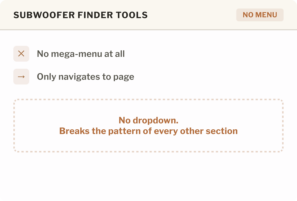
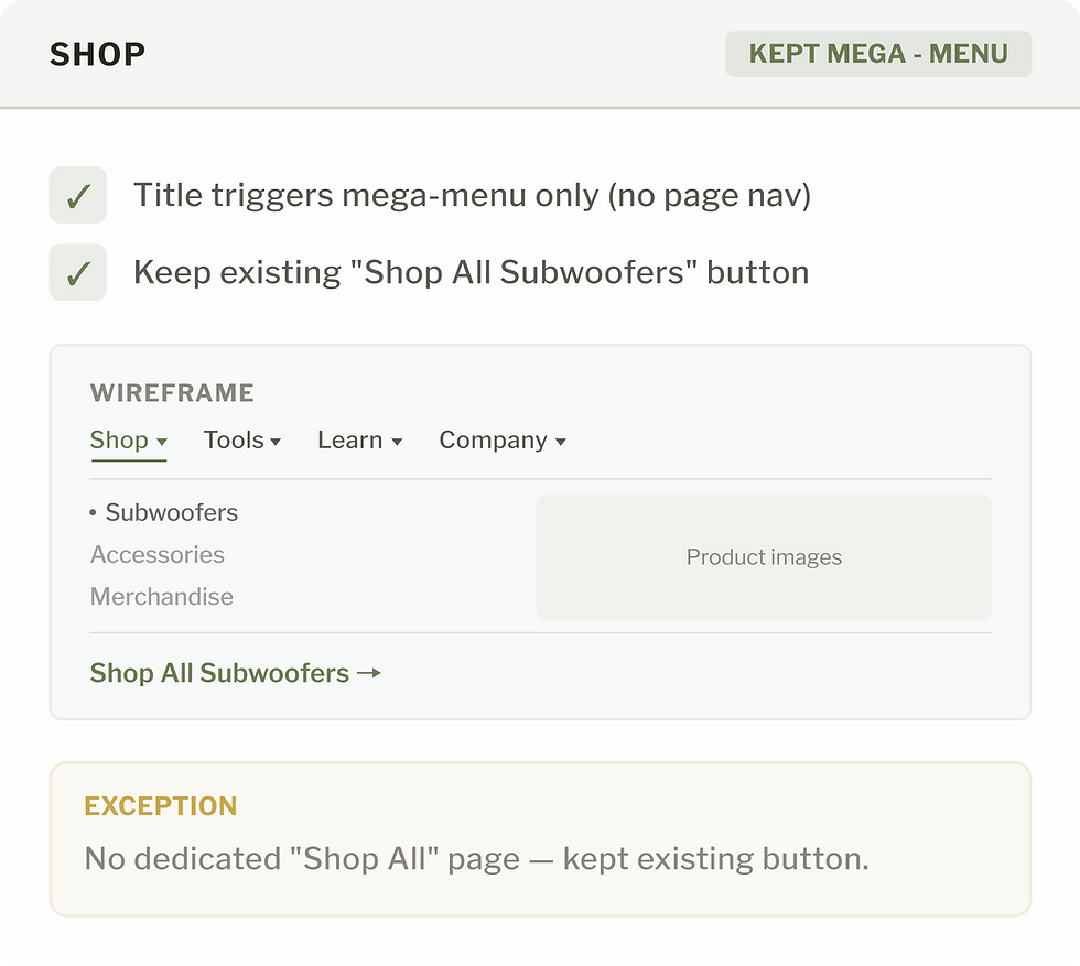
Standardizing 'View All' Behavior
Instead of redesigning individual pages, I defined a set of IA rules that would bring consistency to the entire navigation system.

One set of rules, applied everywhere. Every section now behaves the same way.


— after · shipped
The navigation, live
Here's how the standardized navigation looks across all four sections after the relaunch.

SHOP

SUBWOOFER FINDER TOOLS

COMPANY

LEARN & EXPLORE