
Streamlining Supplier Onboarding
and Central Invoice Management
UI/UX
Dashboard Design
Research

Introduction
SAP Procurement (previously SAP Ariba) is a leading cloud-based procurement platform, empowering businesses with end-to-end visibility and control over their procurement processes.
During the 10-week internship, I had the opportunity to work on two key projects. Starting with an introduction to the company and Supply Management Lifecycle, the first half of the internship was aimed at ideating new design solutions for Supplier Onboarding, followed by enhancing user engagement in Central Invoice Management.
MY ROLE
DURATION
PROJECTS
UX Design Intern
12th June - 18th August
(10 Weeks)
My Responsibilities


Internship Timeline

Project 1 : E2E Supplier Onboarding

Project Overview
The Supplier Onboarding project at SAP aimed to design a solution that simplifies and automates the onboarding process for suppliers. By innovating methods, and improving efficiency and collaboration, the project focused on efficient data entry, reducing manual effort, and improving the experience for both buyers and suppliers.
Streamline the supplier onboarding process, making it easier for new suppliers to join the buyer's organization directory.
The Goal
[My role in this project primarily focused on generating ideas and conceptualizing solutions rather than implementation.
While I contributed to the ideation process, the execution and implementation of these ideas were carried out by other team members and stakeholders.]
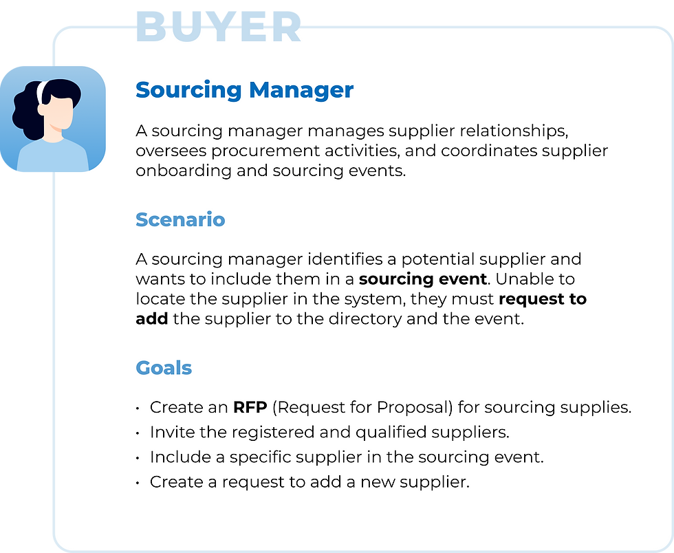
Main Users


Identified Challenges
Based on the findings from the UX research conducted prior to my involvement, several overarching pain points in the dashboard's functionality were identified.

Need for Effective Supplier Discovery

Insufficient
User Support

Need for more Efficient use of space

Challenges in Communication

Lack of
Real-Time Tracking
Wireframes and Design Solutions
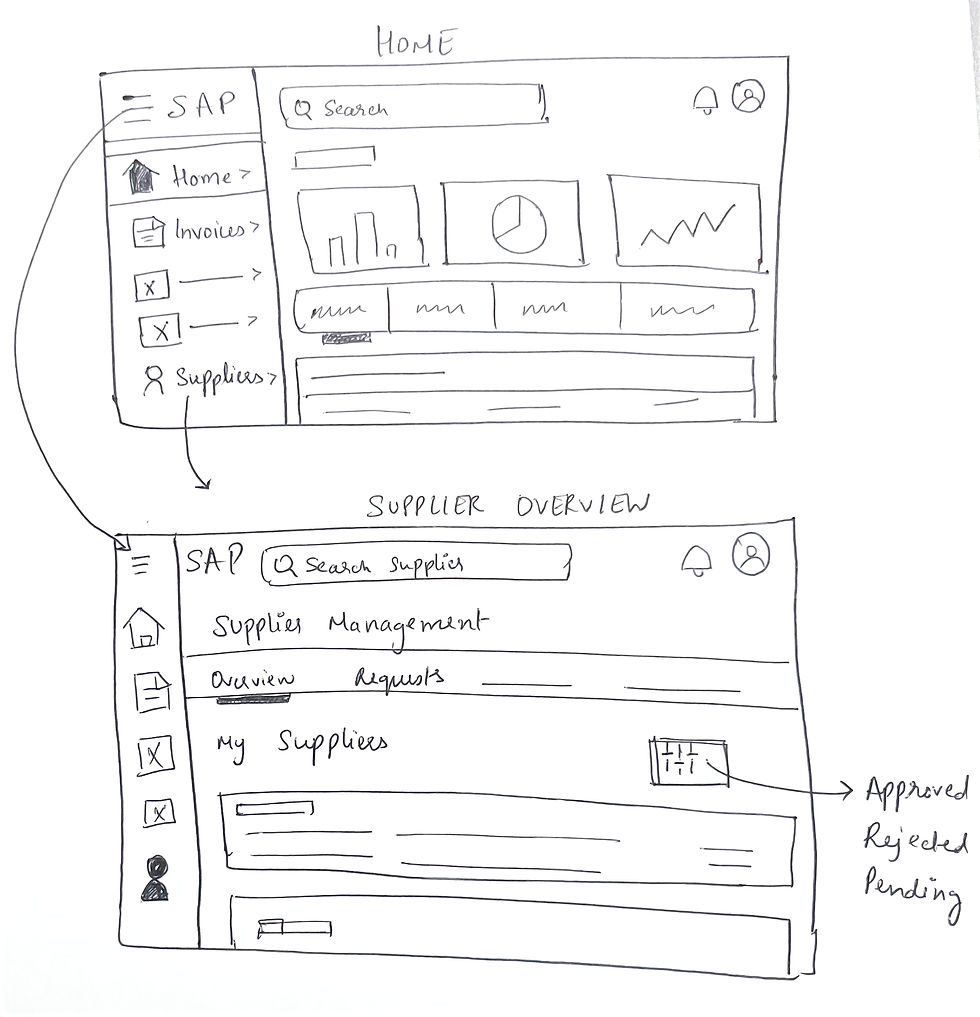
To address the challenges, I began with rough, low-fidelity sketches. These helped visualize potential solutions, brainstorm approaches, and quickly iterate ideas


Building on the initial sketches, I developed high-fidelity wireframes to address specific challenges identified earlier.
SUPPLIER OVERVIEW PAGE
Enhancements aimed at improving functionality and user experience for the overview page.
Immediate Action Visibility
Placement of notification and inbox icons on the top bar for immediate action and response, facilitating buyer-supplier collaboration.

Focused Supplier Search
Unified Search and Filtering
Dedicated supplier search page added to the sidebar for quick and focused supplier discovery.
Integration of saved searches, external searching, and filters into a unified interface for streamlined user experience.
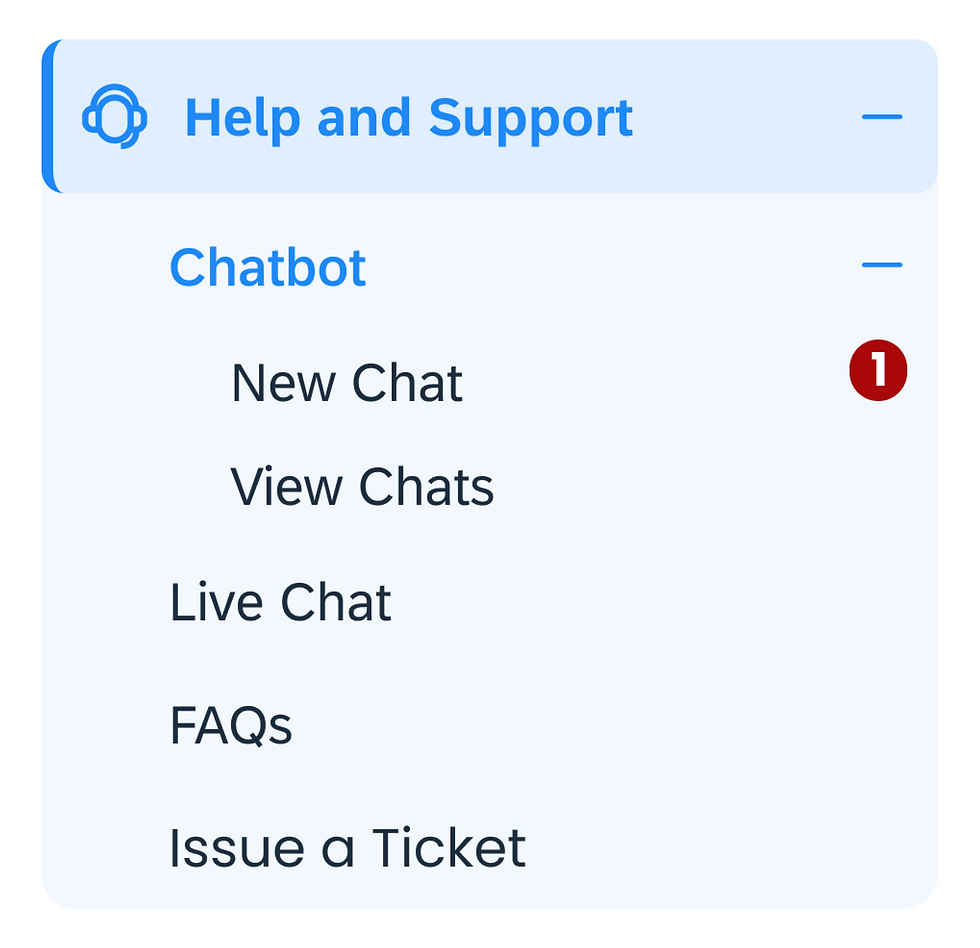
Direct Support Communication
Direct communication feature for users to connect with the support team for assistance and form guidance.
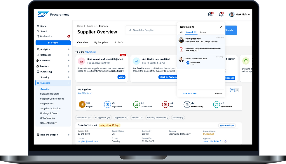
AUTOMATED NOTIFICATIONS
Notification pop-up providing real-time updates and a quick preview of request progress, with automated notifications to inform suppliers about onboarding status.

Notification pop-up providing real-time updates, with automated notifications and reminders to keep suppliers informed about their onboarding status.
After completing the ideation phase for the Supplier Onboarding project, I moved on to the next significant challenge: designing an effective landing page for the Centralized Invoice Management (CIM) system.
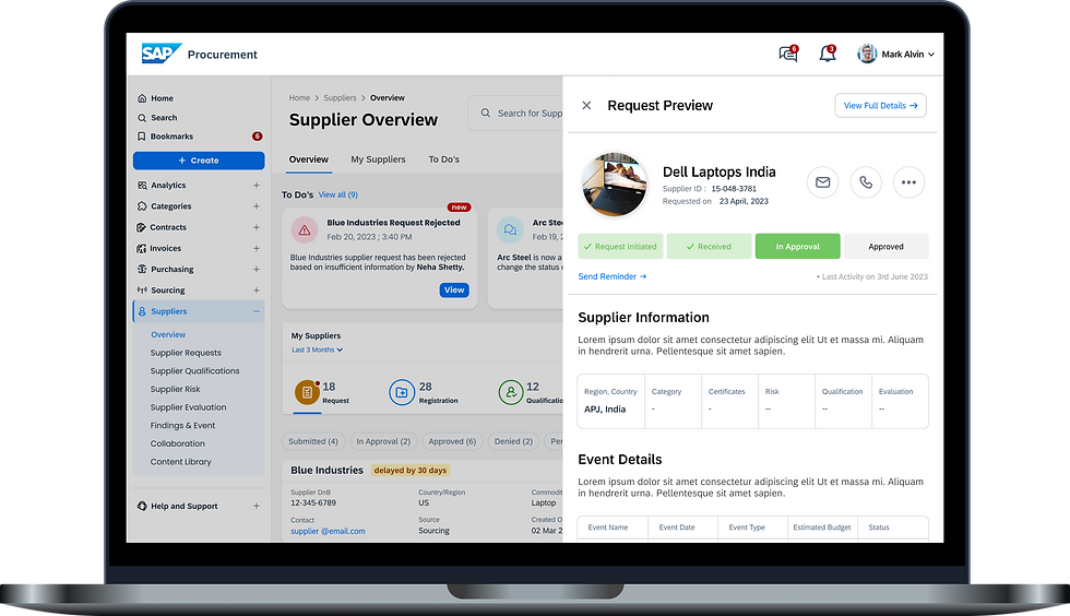
ONBOARDING PROGRESS TRACKER
Provide a clear, visual progress tracker to display suppliers' current status in the onboarding process.
Prompt suppliers about pending actions or updates in the onboarding process.
Send Reminder
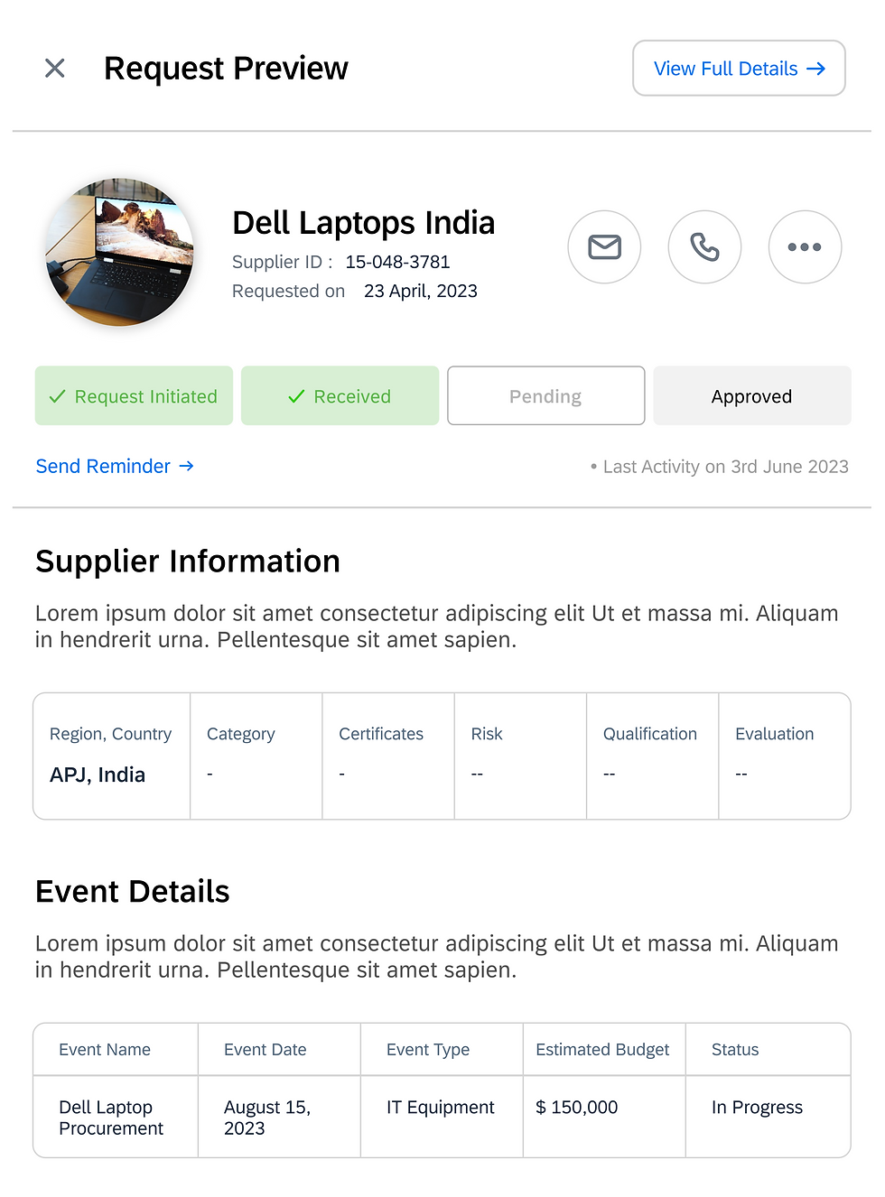
The tracker shows the supplier's onboarding status, moving from "Request Initiated" and "Received" to "In Approval" for final evaluation.
Sequential Progress Tracker
It can then progress to "Pending" for further review, directly to "Approved" if all criteria are met, or to "Denied" if the request does not meet the necessary standards.

Wireframes and Design Solutions
LOW FIDELITY
To begin addressing the user feedback, I started with a low-fidelity wireframe. This initial sketch pieced together key insights from the user research, allowing me to visualize potential solutions and iterate on the design.

CTA Button &
Invoice Info Cards
Provide immediate visibility and actionability, addressing user feedback for a more efficient homepage.
Moved "Invoices that Require Action" section up in the dashboard

Higher visibility and accessibility
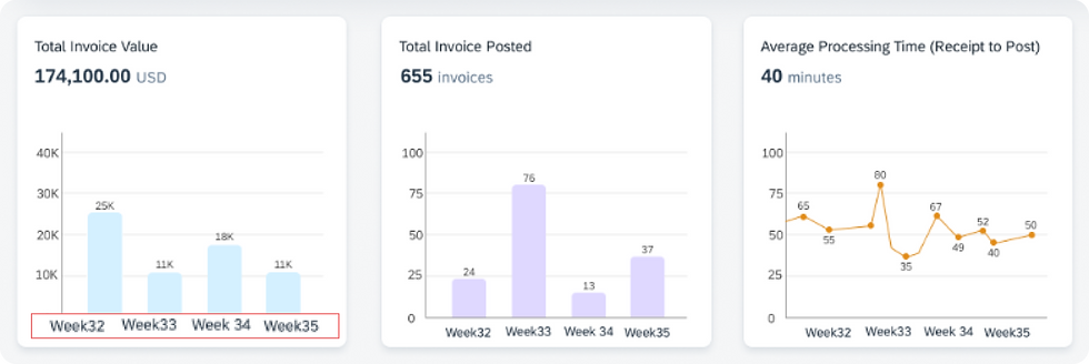
Consolidated Statistics Section with Toggle Options
Optimize dashboard space and reduce prominence, reflecting user feedback on utility

In addition to the low-fidelity screen, I developed a detailed wireframe focusing specifically on enhancing the 'Invoices that Require Action' and 'Statistics' sections of the dashboard.
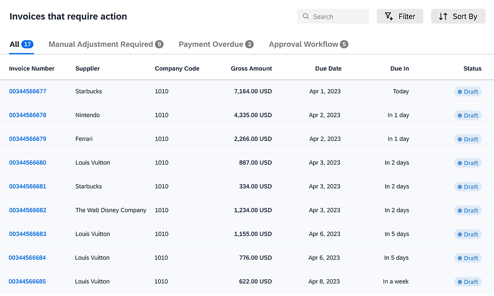

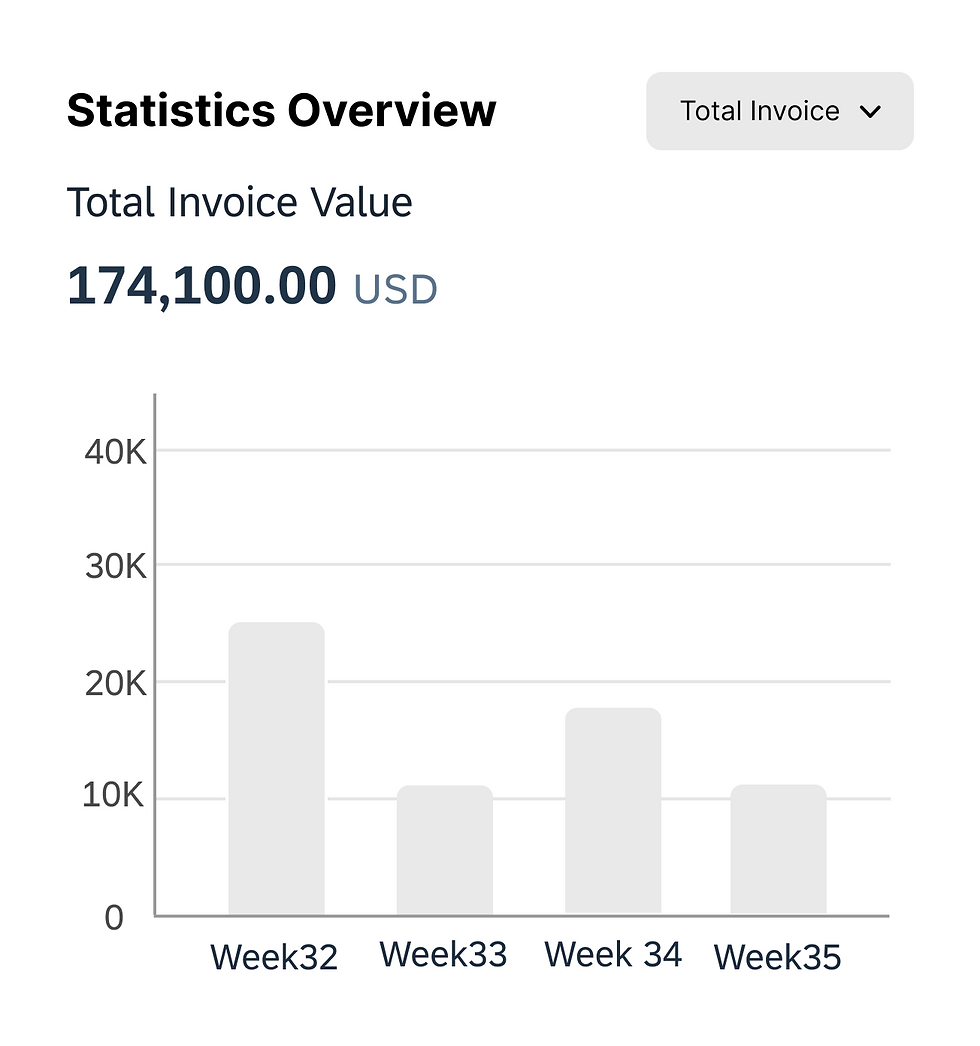

Statistics Overview for immediate access; users can toggle between different metrics

Enabling quick and precise navigation through invoices
HIGH FIDELITY DESIGN ITERATION - 1
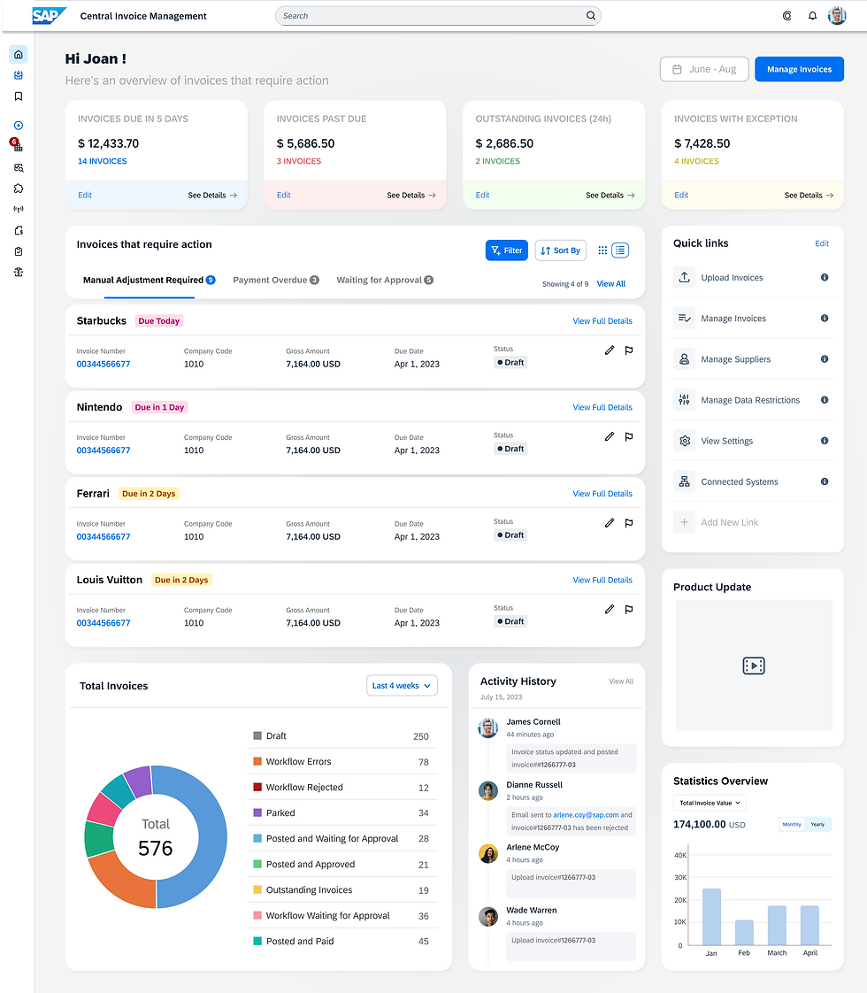
Incorporating feedback from the low-fidelity wireframes, I created a high-fidelity design. Let’s break down each section to understand the redesign and the thinking behind each change.
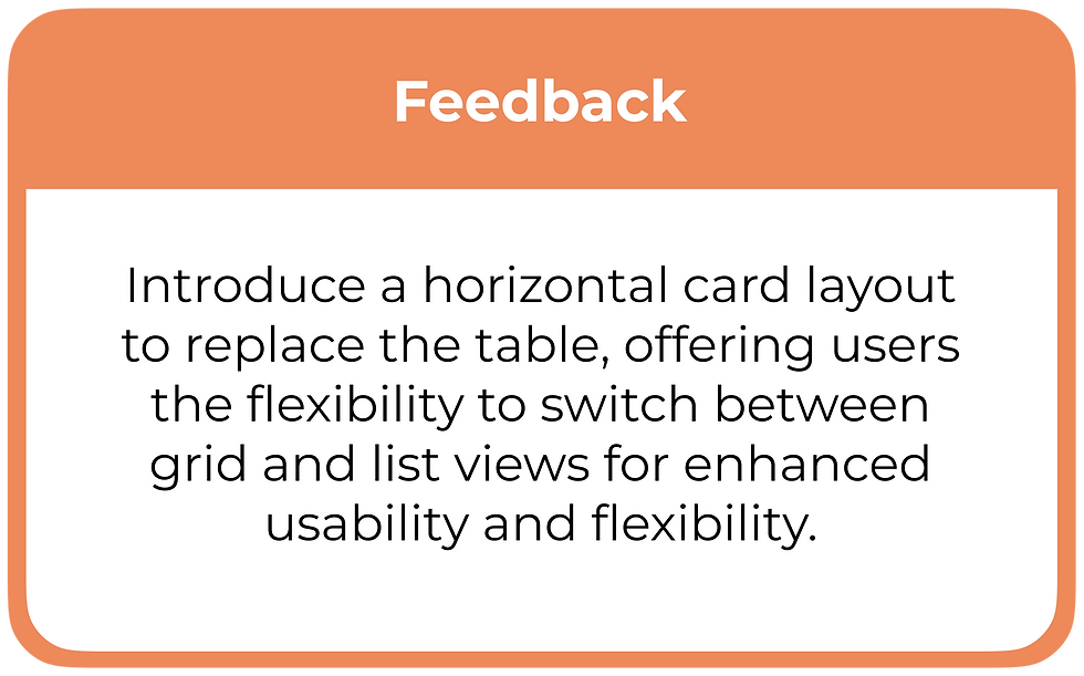
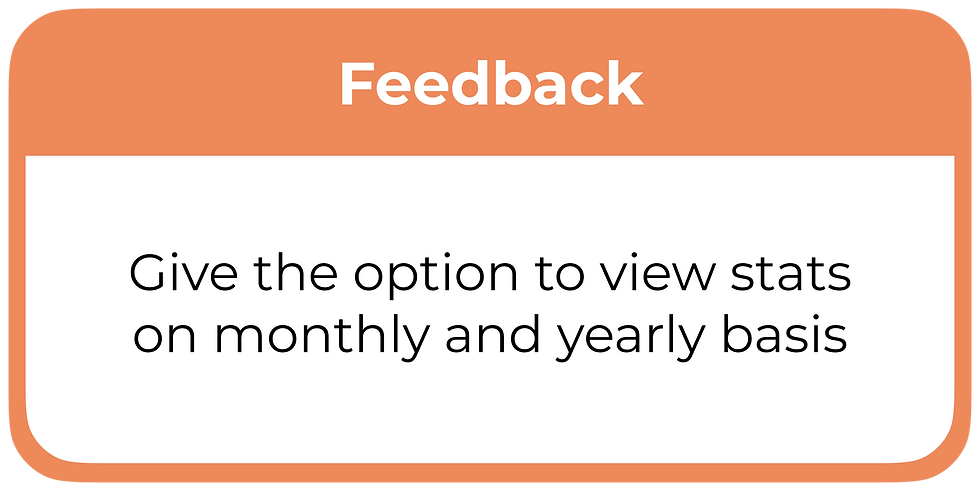
Feedback
Implement a quick preview feature for invoices that includes an "Invoice History" section, displaying details such as who approved the invoice and the approval date.
Simplify the categories in the ‘Total Invoices’ section.
In the invoice cards, prioritize displaying the number of invoices over the total amount .
Include the name of the owner in the invoice list.
HIGH FIDELITY DESIGN ITERATION - 2

Clicking "View Full Details" opens a quick preview, showing a progress timeline and invoice history with user actions, providing transparency and tracking for efficient invoice management.
Enhancing Invoice Transparency


Conclusion & Reflections
As my internship came to an end, the designs I created were further developed and refined by the other designers on the team. This handover ensured that the project continued to evolve and improve, ultimately meeting the needs of the users more effectively.
Challenges
⏳
🔄
📚
TIME CONSTRAINTS
SHIFTING PRIORITIES
LEARNING CURVE
With only 10 weeks to complete the internship, time was a significant limitation.
Managing dual project assignments required flexible prioritization, dividing my focus between tasks to ensure effective contribution to both.
Diving into the unfamiliar territory of procurement posed a challenge while balancing project deadlines.
🏢
CORPORATE EXPERIENCE
This internship marked my first experience as a designer in a large company, providing valuable insights into how corporate environments function and how design fits into larger organizational goals.
Learnings
🤝
COLLABORATIVE LEARNING
Engaging with fellow designers and researchers provided invaluable learning opportunities through their expertise and guidance.
Thanks for Reading ! ☺️
Project 2 : Central Invoice Management Landing Page
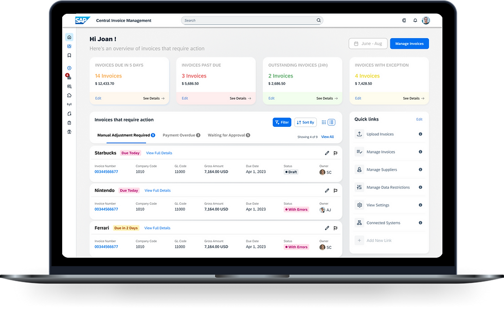
The Central Invoice Management Landing Page project focused on improving user engagement and operational efficiency within the Accounts Payable (AP) department. Leveraging insights from the latest research, the project involved identifying the most useful components of the existing dashboard and reorganizing and redesigning these sections based on user feedback to streamline workflows and better meet user needs.
Project Overview
To enhance the usability and efficiency of the Central Invoice Management Landing Page by redesigning its layout and features based on user research.
My responsibilities included shadowing 1:1 user research sessions, taking detailed notes, generating ideas, designing wireframes, and iterating designs based on user feedback.
The Goal
User Group Overview
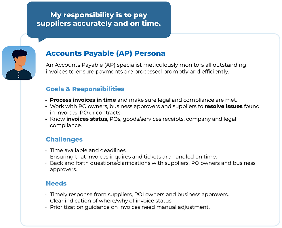
The project focuses on accountants and AP specialists who handle the end-to-end processing of invoices.
This group includes professionals with varying levels of experience, such as those in the oil and gas industry, logistics, and engineering sectors.
Overview of Existing Dashboard

Personalised Header
AP Metrics
A list of invoices that have been edited by the user
Overview of invoices in the system
Information about recent updates or new features
Highlights invoices that need immediate attention
Shortcuts to frequently used features or sections
User Interviews & Key Findings
To evaluate the usability and effectiveness of the current dashboard, we conducted user testing sessions with 9 Accounts Payable (AP) professionals, ranging from Operations Accountants to AP Managers and Analysts.
The feedback from these sessions provided essential insights into the most valuable features for users, highlighted areas needing improvement, and guided the prioritization and rearrangement of dashboard sections based on their practical value.



9/9 Participants expect the home page to be action-oriented
Prominently display action item statistics in the banner for immediate visibility
Allow participants to customize it either monthly/yearly
Participants had varied interpretations of this section and think “Recent Activities” would be more useful.
Participants preferred status categories they frequently use at work
Include categories suggested by the participants
9/9 participants rated this as the most helpful feature as it provides a clear indication of the invoices that require immediate attention
Consider moving it to the top for better visibility
“While statistics are helpful, they will have no direct impact on the daily work”
"This section can be renamed as 'Waiting for Approval'."
"Ensure the status colors for 'Total Invoices' and 'Invoices that require action' are consistent, as these sections are connected."
"Need an option to flag invoices if the approval time is too long"


