Yabla —
a system-led integration
Product Design
Systems Thinking
Reducing Product Fragmentation in a Language Learning Platform

Yabla · Language Learning
UX Design
Product Design
Systems Thinking
Language Learning
ROLE
Product Designer · Live Learning Lead
PLATFORM
Web
DURATION
6 Months
OVERVIEW
What is Yabla?
Yabla is a language learning platform that's been around for over two decades. That longevity comes with real strengths — a loyal user base, deep content libraries, and genuine trust from long-term learners.
But it also comes with baggage. Over 20 years, different teams shaped different parts of the product independently. By the time I joined, Yabla felt less like a unified platform and more like a collection of tools that happened to share a domain.
20+
Years of product history
3
Products to unify
2
Designers on the team
1
Goal: coherent UX
THE PRODUCT ECOSYSTEM
Three experiences. One platform.
Yabla had expanded beyond video-based learning to include two new features — each with its own structure, logic, and audience. Bringing them together meant rethinking how the entire platform fit as one product.


WHO WE DESIGNED FOR
The users most products forget.
Yabla's user base isn't your typical app demographic. Because the platform grew organically over decades, the majority of active users are 40–60+ years old — loyal, engaged, and not particularly tech-savvy.
"If it's not obvious to someone who didn't grow up with smartphones, it's not obvious enough."
This became the guiding principle behind every layout decision, every label, every navigation choice.

THE PROBLEM
Two products. One platform.
A growing inconsistency problem.
When I joined Yabla, three overlapping challenges were happening at once.
01
Fragmented platform
Years of independent development left the product with inconsistent navigation, redundant components, and no shared design language.
02
New features, old foundation
Fluency Club and Live Learning were being built on top of a platform that was already inconsistent. Without deliberate structure, they risked becoming more isolated islands.
03
Two design languages colliding
GoSpanish and Yabla had completely different UI patterns and navigation logic. Merging them wasn't a content migration — it was a design reconciliation.

"The real challenge wasn't just designing new features. It was designing them in a way that made the whole product feel like it had always belonged together."
MY ROLE
Where I came in.
I led UX and UI design for Live Learning end-to-end — from structure and flows through final screens and components.

Joining fresh meant I saw the product the way a new user would — inconsistencies that long-time team members had stopped noticing became immediately visible to me.
THE CHALLENGE
Designing for today
while planning for tomorrow.
A full redesign wasn't realistic. The team was small, the codebase was old, and there was real pressure to ship.

DESIGN STRATEGY
A system-led approach
to integration
Three principles shaped every decision made during this project. Together, they aligned Live Learning with Fluency Club — Yabla's newest design system, rather than the older patterns the rest of the platform still ran on.


THE WORK
From legacy to live
After mapping the strategy, I translated it into the actual product. Here's what shipped — and how the experience evolved from GoSpanish's standalone interface into a fully integrated part of Yabla.
01 · THE DASHBOARD
Live Learning, fully integrated.
Two class types — Group and Private — with completely different scheduling logic, unified under the same navigation shell, card patterns, and visual hierarchy. Built on Fluency Club's design language and structured for discoverability, clarity, and trust.

02 · STATE-DRIVEN COMPONENTS
One card. Multiple lives.
The class card adapts to its time-based state — countdown, ready, live — within a single reusable component. No duplicate layouts, no engineering bloat.

Countdown → Join
03 · THE MIGRATION · GROUP CLASSES
From GoSpanish to Yabla Live Learning.
Six key features mapped from the legacy interface to a structured, system-aligned redesign. Each pin shows what got simplified, restructured, or quietly absorbed into the new design language.
Before - GoSpanish Group Classes

After - Yabla Group Classes


04 · THE MIGRATION · PRIVATE CLASSES
Booking, redesigned.
The same three strategic moves applied to a different layout: restructure the core content, reorganize visual hierarchy, demote utilities to the side. Same design language, same decision-making — different surface.
Before - GoSpanish Group Classes

After - Yabla Group Classes

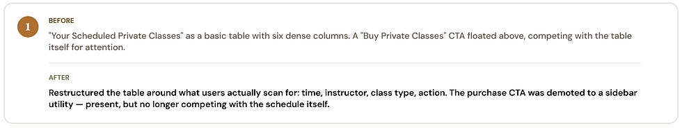


The same design judgment applied twice. Consistency isn't a coincidence — it's the system working.
"For users who'd been on the platform for years, the goal wasn't to impress them with something new. It was to make the new feel like it had always been there."
WHAT HAPPENED
What happened when it shipped.


